
- Home
- Elections
- Cardinalympics
-
About LSA
-
Organizations
-
Clubs and Sports
- Club Resources
- Academic Competition Clubs at Lowell >
-
Culture and Religion Clubs
>
- Agape Christian Club
- Anime Club
- Armenian Club
- Chinese Cultural Entertainment Club
- Black Student Union
- Burmese Club
- Chinese Cultural Club
- Chinese Traditional Art
- Fil-Am Club
- History Club
- Gender Sexuality Alliance (GSA)
- Hapa Club
- Japanese Club
- Korean Club
- Latin Club
- Latinos Unidos
- Lion Dance ME
- M.E.N.A
- Muslim Student Association
- Polynesian Club
- South Asian Club
- Vietnamese Student Association
- Entrepreneurship & Finance >
- Food and Crafts Clubs >
- Games and Fantasy Clubs >
- Health and Environment Clubs >
- Literature and Media Clubs >
- Politics and Public Speaking Clubs >
-
STEM Clubs
>
- 3D Printing Club
- Artificial Intelligence Club
- Aerospace Club
- Astronomy Club
- Bioinformatics Club
- Biomedical Club
- Chemistry Club
- Criminal Investigative Forensics (C.I.F)
- Economics Club
- EcoSTEM
- EECS Club
- Girls Who Code
- Let's Learn Everything Club
- HOSA Club
- Marine Biology Club
- Mathematics Society
- Physics Circle
- Pre-Dental Club
- Pre-Med Club
- Project Code
- Science Days
- Science Society
- Sports Medicine Club
- Stem4Kids Club
- Understand Energy Club
- Genetics
- Health Science Initiative
- Lowell Particle Physics
- PSYchology Club
- Quantitative Trading
- Quiz Bowl
- SWEEZY Software Development
- US National Computer Science Olympiad Club
- Sports >
-
Visual and Performing Arts Clubs
>
- Art Club
- Ballroom Dancing
- Creating Graphic Novels Club
- Design Club
- EcoArt Club
- Fashion Club
- Film Production Club
- Film Festival Club
- Jazz Band Club
- Multimedia Club
- Guitar Club
- Music for Chickens
- Music for Elderly
- Industrial Design Outreach Club
- Photo Editing Club
- Theater Tech
- K-pop Club
- Mixtape Club
- Ukulele Club
- Orchestra Leadership Club
-
Volunteer and Public Service Clubs
>
- Acts of Random Kindness
- CCDC Youth Club
- After School Tutor
- Best Buddies
- BuildOn
- CARE Club
- Community Awareness Club
- CLEAN THE STREETS
- Community Improvement Service Club
- Education for Developing Countries
- Feed The Hungry Club
- EmpowerHer
- Goodie Bag Club
- Heart in Motion
- Helping the Unhoused
- Helping in Children's Hospitals
- Hustle and Heart
- Interact Club
- Key Club
- Lowell Lifting Lives
- Partners Against Institutionalized Racism
- PAWS
- Period Lowell
- Red Cross Club
- Photography for business
- Project Open Hand
- Supporting Children in Need
- Team HBV/Join Jade
- SASHA
- Teens for Tutors
- Sports Equity Club
- UCSF Junior Ambassadors
- UNICEF
- US Veterans
- Tech Literacy Club
- YCE
- Youth Homelessness Advocacy
- Women's Student Union
- Resources
- Archives
- Freshmen Corner
- @lowellhs Instagram Feed
- Search
Acceptable Image Examples
Images are easily readable without excessive text, clearly stating the name of their club. More detailed images include visual cues about their club. Images can range from plain text to decorative text on a colorful background. All designs have an aspect ratio of 1:1 (square or circle).
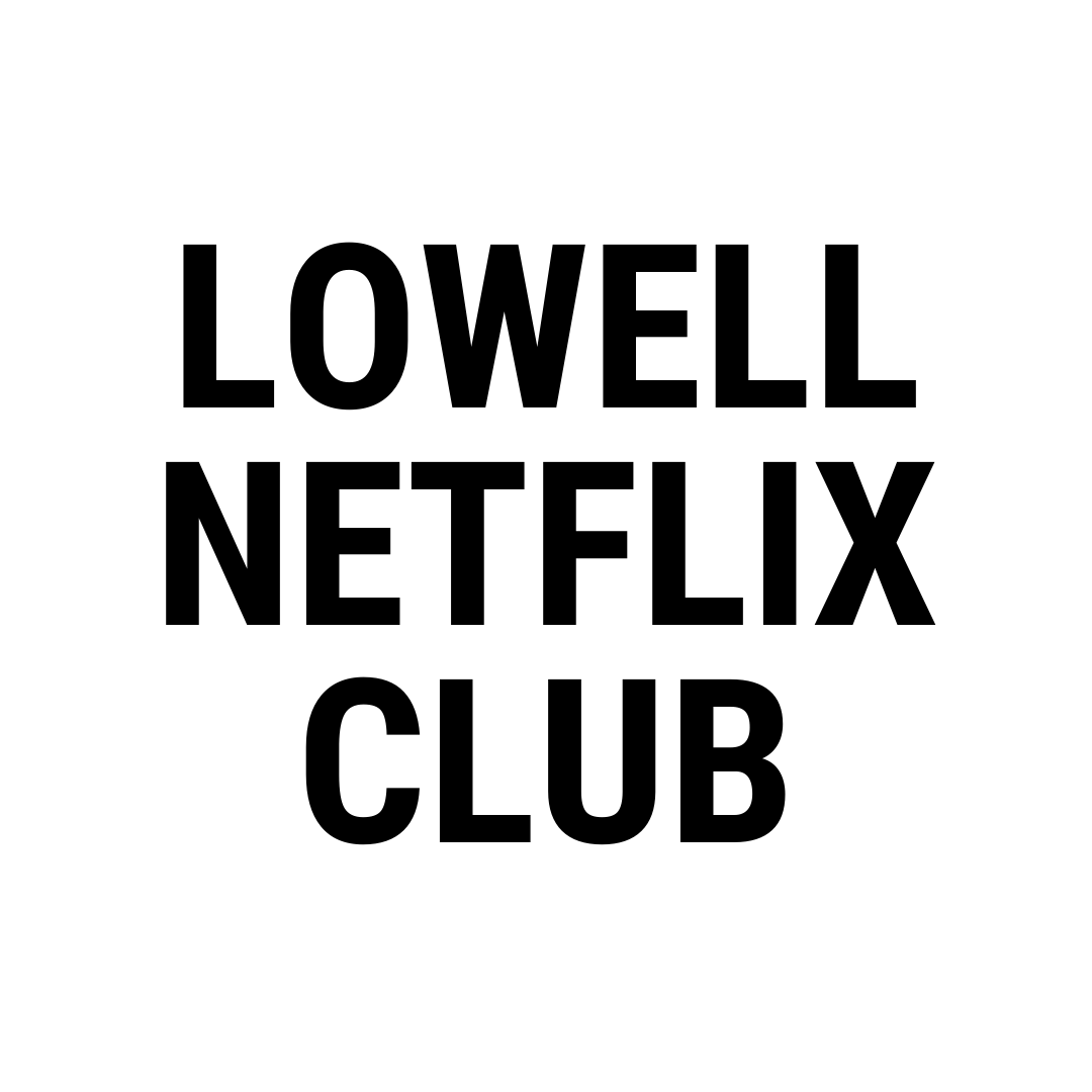
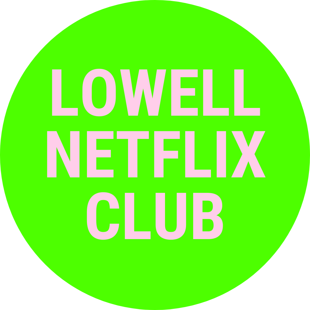
Unremarkable but acceptable; club name is clearly displayed
|
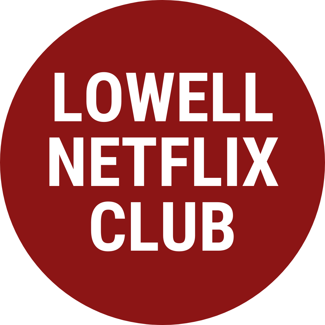
Use of circle is fun and refreshing; color is nice and name is clearly stated
|

Eye-catching; name is clearly stated, background depicts club activities, and call to action is displayed ("Click For More!")
|
Good Examples from Lowell Clubs and Organizations
|
|

|
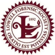
|
Make sure images are legible; 1,000 pixels x 1,000 pixels should be sufficient. Avoid excessively large files (5,000px x 5,000px is unnecessary). If your club is a chapter of a larger association (such as FBLA), you may use their logo.
Unacceptable Button Examples
Images are excessively generic and contain little to no context for the club. No name is readable or displayed. Messages displayed are inappropriate or contradictory to LSA, Lowell, or SFUSD guidelines and values.

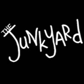
Overly generic
|

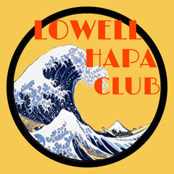
Am I going to netflix.com or am I going to learn about the Lowell Netflix Watch Club?
|
Clashing excessively-vibrant colors make it hard to read
|
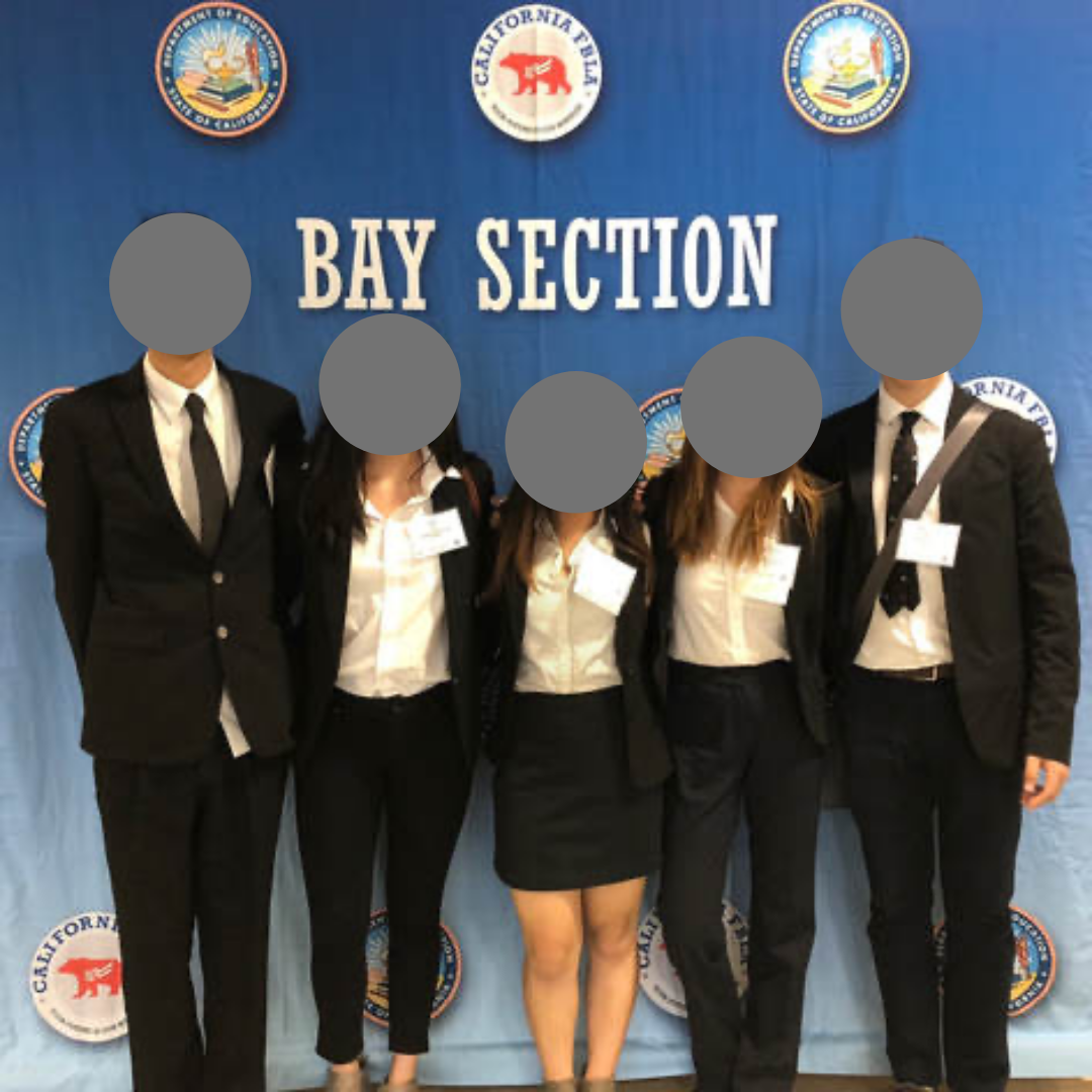
People won't be able to recognize what your club is just from a group photo
|
© 2023 Lowell Student Association
- Home
- Elections
- Cardinalympics
-
About LSA
-
Organizations
-
Clubs and Sports
- Club Resources
- Academic Competition Clubs at Lowell >
-
Culture and Religion Clubs
>
- Agape Christian Club
- Anime Club
- Armenian Club
- Chinese Cultural Entertainment Club
- Black Student Union
- Burmese Club
- Chinese Cultural Club
- Chinese Traditional Art
- Fil-Am Club
- History Club
- Gender Sexuality Alliance (GSA)
- Hapa Club
- Japanese Club
- Korean Club
- Latin Club
- Latinos Unidos
- Lion Dance ME
- M.E.N.A
- Muslim Student Association
- Polynesian Club
- South Asian Club
- Vietnamese Student Association
- Entrepreneurship & Finance >
- Food and Crafts Clubs >
- Games and Fantasy Clubs >
- Health and Environment Clubs >
- Literature and Media Clubs >
- Politics and Public Speaking Clubs >
-
STEM Clubs
>
- 3D Printing Club
- Artificial Intelligence Club
- Aerospace Club
- Astronomy Club
- Bioinformatics Club
- Biomedical Club
- Chemistry Club
- Criminal Investigative Forensics (C.I.F)
- Economics Club
- EcoSTEM
- EECS Club
- Girls Who Code
- Let's Learn Everything Club
- HOSA Club
- Marine Biology Club
- Mathematics Society
- Physics Circle
- Pre-Dental Club
- Pre-Med Club
- Project Code
- Science Days
- Science Society
- Sports Medicine Club
- Stem4Kids Club
- Understand Energy Club
- Genetics
- Health Science Initiative
- Lowell Particle Physics
- PSYchology Club
- Quantitative Trading
- Quiz Bowl
- SWEEZY Software Development
- US National Computer Science Olympiad Club
- Sports >
-
Visual and Performing Arts Clubs
>
- Art Club
- Ballroom Dancing
- Creating Graphic Novels Club
- Design Club
- EcoArt Club
- Fashion Club
- Film Production Club
- Film Festival Club
- Jazz Band Club
- Multimedia Club
- Guitar Club
- Music for Chickens
- Music for Elderly
- Industrial Design Outreach Club
- Photo Editing Club
- Theater Tech
- K-pop Club
- Mixtape Club
- Ukulele Club
- Orchestra Leadership Club
-
Volunteer and Public Service Clubs
>
- Acts of Random Kindness
- CCDC Youth Club
- After School Tutor
- Best Buddies
- BuildOn
- CARE Club
- Community Awareness Club
- CLEAN THE STREETS
- Community Improvement Service Club
- Education for Developing Countries
- Feed The Hungry Club
- EmpowerHer
- Goodie Bag Club
- Heart in Motion
- Helping the Unhoused
- Helping in Children's Hospitals
- Hustle and Heart
- Interact Club
- Key Club
- Lowell Lifting Lives
- Partners Against Institutionalized Racism
- PAWS
- Period Lowell
- Red Cross Club
- Photography for business
- Project Open Hand
- Supporting Children in Need
- Team HBV/Join Jade
- SASHA
- Teens for Tutors
- Sports Equity Club
- UCSF Junior Ambassadors
- UNICEF
- US Veterans
- Tech Literacy Club
- YCE
- Youth Homelessness Advocacy
- Women's Student Union
- Resources
- Archives
- Freshmen Corner
- @lowellhs Instagram Feed
- Search